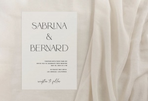
Combining fonts is a craft that takes time and patience, but it can be extremely rewarding. It might turn out looking like the work of a master-type designer or someone with no eye for design at all!
But there are some things you can do to give yourself the best chance of creating successful type combinations. Here are 10 reasons why you should combine text fonts!
1- Make a Stronger Statement
The statement your design makes is very important and one way to improve it is by choosing two fonts that contrast with each other. For example, if you were designing a poster for an outdoor concert, you might use sans serif fonts with thick weights for the main text and a decorative or script font for the subheading. This combination would make your design more interesting because the two fonts contrast with each other in many ways- by weight, style, size, and the message they convey.
2- Visual Balance
Similar to number one, combining fonts is also a way you can balance out your design so it’s not too heavily weighted on one side. For example, if you were using a decorative serif font as your main heading and a sans serif as your subheading, the design would feel too different with one thick custom font and one thin sans serif. To create a cohesive design, you could make your main heading in the same style as your subheading or choose two fonts that are similar in weight or size.

3- Combine Fonts for Personality
Combining fonts is also a great way to express your design’s personality. This is especially helpful if you are designing for an organization with a strong brand identity or you want to give your design a specific voice or tone. Maybe the voice in your head wants to be playful and fun, edgy and unique, classy but professional, etc. So find fonts that fit with that vision and combine them to create a design that provides the desired message.
With CreativeMarket, you can find a wide variety of fonts that you can mix and match.
4- Combine Fonts To Show Hierarchy
If you have a lot of information to convey in your design, it’s important to think about how best to organize that information so it’s easy for your reader to digest and navigate. You can do this by changing the styles (e.g., italic, all caps, etc.) of different fonts to distinguish between the headers and body text or by combining fonts with complementary personalities. This way, you can help your reader move through the different sections of your design with ease.
5- Bring Balance Between Elements
Balance in typography is tricky because it can be really hard to achieve. But balance can make or break your design, so you’ll want to avoid creating an imbalance with your fonts that distracts from the rest of your design. You can achieve better balance by using the same typeface family for different elements (e.g., headlines and body text) or choosing two fonts that contrast with each other in a complementary way.
You can also create a better balance with your typography by choosing a font for each section of your design that is similar in weight, style, and personality.

6- Combine Fonts To Improve Legibility
In order to improve the legibility of your work, you’ll want to focus on combining fonts that have different personalities but are still readable in smaller sizes. For example, if you were using a very decorative font for your main heading, you might want to use one that is more legible than the main body text. This way, readers would be able to read the headings and the rest of the text without too much strain.
7- Combine Fonts For Better Readability Over Time
If you are designing something that will be read over time, then combining fonts is an excellent way to create designs that are readable across different platforms. For example, if your design will be viewed across different devices, e.g., computer, phone, iPad, etc., you will want to use fonts that are web-friendly so they appear clean and crisp everywhere. If the readers of your website or book might be older or younger than your target audience, you’ll also want to consider how legible certain fonts will be for these people as well.
8- Combine Fonts To Build Trust
Let’s face it. If you are making a website for your company or clients, the decisions you make when combining fonts is going to reflect on them in some way. So if you want to build trust with your audience and give them a sense of security about who they’re doing business with, then you will want to use fonts that project a certain personality they can relate to and develop trust with. There are plenty of alphabet fonts available beyond the most popular ones like Helvetica and Times so try looking for other options in your font library to see if there is something more suitable for your organization or business.
In Closing
There is a font for practically any application and purpose you could think of. However, the best way to maximize your use of fonts is by combining them together in creative ways that complement each other and create an aesthetically pleasing design.
